

The Top 5 Ways to Boost Yourchoose a right color in Graphic Design

Hello there, fellow designers! Are you struggling with choosing the right colors for your graphic design projects? Fear not, as I’m here to share with you the top 5 ways to boost your color choices in graphic design. As we all know, color is an essential element in design. It can evoke emotions, convey messages and create a lasting impression on the viewer. That’s why it’s crucial to choose the right colors for your design.
So, without further ado, let’s dive into the five ways to boost your color choices in graphic design!
Understand Color Theory
We’ll dive deeper into the first way to boost your color choices in graphic design: understanding color theory.
Color theory is the foundation of color in art and design. It’s the science of how colors interact and how we perceive them. Understanding color theory will help you create visually appealing designs that convey the right message to your audience.
I. Explanation of the Color Wheel and How it Works
The color wheel is a visual representation of the relationships between colors. It’s a circular diagram that shows the primary colors, secondary colors, and tertiary colors. The primary colors are red, blue, and yellow. These colors cannot be made by mixing other colors. Secondary colors are created by mixing two primary colors. The secondary colors are green (made by mixing blue and yellow), purple (made by mixing blue and red), and orange (made by mixing red and yellow). Tertiary colors are created by mixing a primary and a secondary color. For example, red-orange is a tertiary color made by mixing red and orange.

The color wheel is divided into warm colors and cool colors. Warm colors include red, orange, and yellow, and they often evoke feelings of warmth, energy, and excitement. Cool colors include blue, green, and purple, and they often evoke feelings of calmness, serenity, and relaxation.
II. Primary, Secondary, and Tertiary Colors
Primary colors are the building blocks of all other colors. They cannot be created by mixing other colors. Secondary colors are created by mixing two primary colors. Tertiary colors are created by mixing a primary and a secondary color. Understanding the relationships between these colors is essential for creating harmonious color schemes.
III. Complementary Colors and How to Use Them Effectively
Complementary colors are colors that are opposite each other on the color wheel. They create a vibrant and dramatic contrast and are often used to create a focal point or draw attention to a specific element in a design. For example, red and green are complementary colors. When used together, they create a vibrant contrast that catches the eye.
When using complementary colors, it’s important to use them sparingly and in a balanced way. Too much of one color can overpower the other and create an unpleasant effect. Using complementary colors in a design can create a dynamic and visually appealing composition.
Another way to use complementary colors effectively is to use them in a color scheme called split complementary. Split complementary colors are the color opposite a hue’s complement, plus the two colors adjacent to that opposite hue. For example, a split complementary color scheme for red would include blue-green and yellow-green. This color scheme creates a more balanced and harmonious effect while still creating a strong contrast.
In conclusion, understanding color theory is essential for creating visually appealing designs that convey the right message to your audience. The color wheel, primary, secondary, and tertiary colors, and complementary colors are important concepts to understand when creating a color scheme. By using complementary colors effectively, you can create a dynamic and visually appealing composition that catches the eye. So go ahead and experiment with color, and may your designs always be vibrant and visually stunning!
1. Consider Color Psychology
In this section, we’ll be discussing the third way to boost your color choices in graphic design: considering color psychology.
Color psychology is the study of how colors can affect emotions, moods, and behaviors. Different colors can evoke different emotions and feelings in people, and understanding these associations can help you create designs that resonate with your audience.
I. Explanation of How Colors Can Affect Emotions and Behavior
Colors can affect emotions and behavior in different ways. For example, warm colors like red, orange, and yellow are often associated with energy, excitement, and passion. These colors can evoke feelings of warmth and enthusiasm and can be used to create a sense of urgency or importance in a design. Cool colors like blue, green, and purple are often associated with calmness, serenity, and relaxation. These colors can be used to create a sense of calm and tranquility in a design.
II. Overview of Common Associations with Different Colors
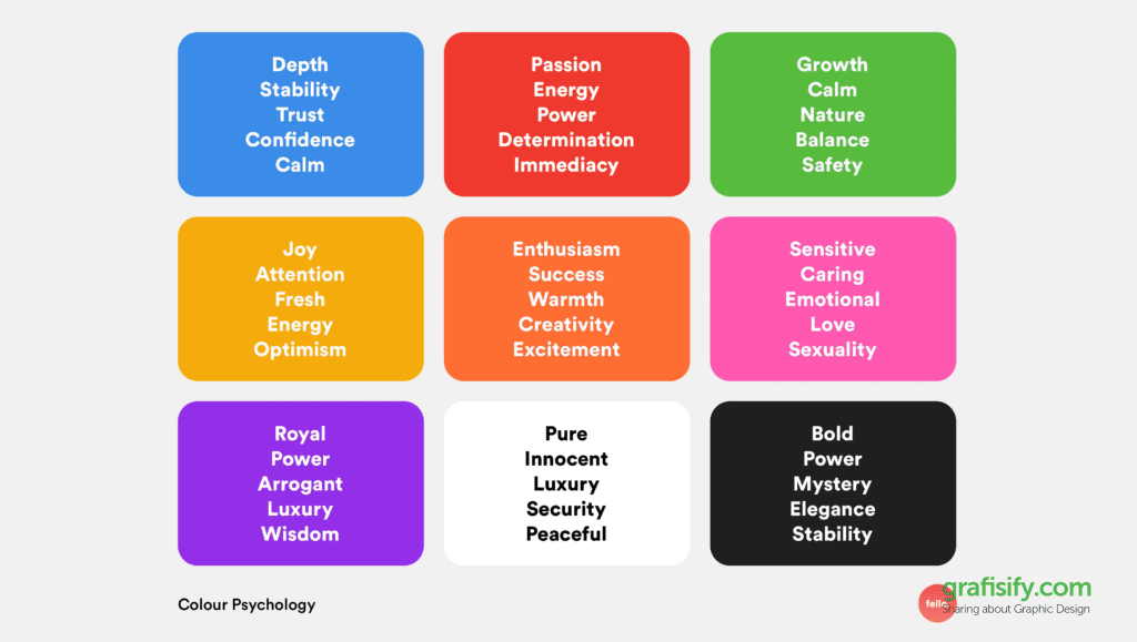
Different colors are often associated with different emotions and feelings. Here’s a quick overview of some of the most common associations:
- Red: passion, love, excitement, urgency
- Orange: energy, warmth, enthusiasm, creativity
- Yellow: happiness, optimism, positivity, clarity
- Green: nature, growth, harmony, balance
- Blue: calmness, serenity, trust, reliability
- Purple: creativity, luxury, spirituality, ambition
- Pink: love, romance, gentleness, sweetness
- Brown: stability, comfort, reliability, earthiness
- Black: sophistication, power, elegance, mystery
- White: purity, cleanliness, innocence, simplicity
III. How to Use Color Psychology in Design to Achieve a Desired Effect
Understanding color psychology can help you create designs that evoke the right emotions and feelings in your audience. For example, if you’re creating a design for a wellness brand, you might want to use calming colors like blue and green to create a sense of relaxation and tranquility. If you’re creating a design for a food brand, you might want to use warm colors like red and orange to create a sense of excitement and urgency.
It’s important to keep in mind that different cultures and contexts can also affect the associations people have with different colors. For example, in Western cultures, white is often associated with purity and cleanliness, but in some Eastern cultures, white is associated with death and mourning.
In conclusion, considering color psychology is an important aspect of graphic design. Different colors can evoke different emotions and feelings in people, and understanding these associations can help you create designs that resonate with your audience. By using color psychology effectively, you can create designs that evoke the right emotions and feelings in your audience and help you achieve your design goals. So go ahead and experiment with color, and may your designs always be emotionally resonant and visually stunning!
3. Use Color Contrast
Hello there, fellow designers! In this article, we’ll be discussing the fourth way to boost your color choices in graphic design: using color contrast.

Copyright – Originally written by Vladimir London and published on: https://watercoloracademy.com/watercolor-academy-news/color-theory-contrasts-of-colors
Color contrast is the difference between two colors, and it’s an essential aspect of graphic design. It can affect readability, visibility, and hierarchy in your design. Understanding how to use color contrast effectively can help you create designs that are visually stunning and easy to read.
I. Explanation of Color Contrast and How it Affects Readability and Visibility
Color contrast is the difference in brightness, hue, or saturation between two colors. It’s an important aspect of design because it affects readability and visibility. Low contrast can make text or images difficult to read, while high contrast can create a dramatic effect and draw attention.
II. Overview of Different Types of Contrast (e.g. Light vs. Dark, Warm vs. Cool)
There are different types of color contrast, and understanding these can help you create designs that are visually appealing and easy to read. Here are some of the most common types of color contrast:
- Light vs. Dark: This type of contrast is created by using light colors against dark colors. It’s often used to create a dramatic effect and draw attention. For example, black text on a white background creates a high contrast and is easy to read.
- Warm vs. Cool: Warm colors (like red, orange, and yellow) create a high contrast when paired with cool colors (like blue, green, and purple). This type of contrast can create a sense of depth and dimension in your design.
- Hue Contrast: This type of contrast is created by using colors that are opposite each other on the color wheel. For example, red and green are opposite each other on the color wheel and create a vibrant contrast.
- Saturation Contrast: This type of contrast is created by using colors that are fully saturated against colors that are desaturated or grayed out. This type of contrast can create a subtle and sophisticated effect in your design.
III. How to Use Color Contrast to Create Hierarchy and Visual Interest
Using color contrast effectively can help you create hierarchy and visual interest in your design. For example, using a high contrast color for headings and a low contrast color for body text can create a sense of hierarchy and make it easier for readers to scan your content.
Using color contrast can also help you create visual interest in your design. For example, using a bright color against a neutral color can create a pop of color and draw attention to a specific element in your design.
It’s important to keep in mind that using too much contrast can be overwhelming and create a chaotic effect. It’s best to use contrast sparingly and in a balanced way.
In conclusion, understanding how to use color contrast effectively is an important aspect of graphic design. Different types of contrast can be used to create hierarchy, visual interest, and readability in your design. By using color contrast effectively, you can create designs that are visually stunning and easy to read. So go ahead and experiment with color contrast, and may your designs always be visually appealing and easy to read!
4. Explore Color Trends
Hello again, fellow designers! In this article, we’ll be discussing the fifth way to boost your color choices in graphic design: exploring color trends.

Color trends can influence design decisions and help you create designs that are current and relevant. However, it’s important to use them in a way that is timeless and effective. In this article, we’ll explore current color trends in graphic design and how to incorporate them in a way that is timeless and effective.
I. Explanation of How Color Trends Can Influence Design Decisions
Color trends can influence design decisions by reflecting current cultural and societal values. For example, pastel colors have been popular in recent years as they reflect a desire for calmness, serenity, and simplicity. By incorporating current color trends in your designs, you can create a sense of relevance and connection with your audience.
Baca juga:
II. Overview of Current Color Trends in Graphic Design
Currently, some of the most popular color trends in graphic design include:
- Pastel colors: Soft, muted colors like pale pink, baby blue, and light yellow create a sense of calmness and tranquility.
- Gradients: Gradual transitions between two or more colors create a sense of depth and dimension in your design.
- Neutrals: Neutral colors like beige, gray, and white create a sense of simplicity and sophistication.
- Bold, vivid colors: Bright, bold colors like hot pink, electric blue, and vibrant green create a sense of energy and excitement.
III. How to Incorporate Color Trends in a Way That Is Timeless and Effective
While it’s important to stay current with color trends, it’s also important to use them in a way that is timeless and effective. Here are some tips for incorporating color trends in a way that is timeless and effective:
- Use color trends sparingly: Don’t overuse current color trends. Instead, use them as accents or highlights in your design.
- Combine trends with classic colors: Pairing current color trends with classic colors like black, white, and gray can help create a timeless and effective design.
- Consider the context: Consider the context in which you’re using color trends. For example, a pastel color palette might be appropriate for a wellness brand, but not for a sports brand.
- Focus on the message: Always prioritize the message you’re trying to convey over current color trends. The colors you choose should support and enhance your message, not distract from it.
In conclusion, color trends can influence design decisions and help create designs that are current and relevant. However, it’s important to use them in a way that is timeless and effective. By using color trends sparingly, combining them with classic colors, considering the context, and focusing on the message, you can create designs that are both current and timeless. So go ahead and experiment with color trends, and may your designs always be relevant and effective!
5. Experiment with Color Palettes
Hello again, fellow designers! In this article, we’ll be discussing the sixth way to boost your color choices in graphic design: experimenting with color palettes.
Creating a cohesive color palette is essential for creating visually appealing and effective designs. In this article, we’ll explore how to create color palettes that work well together, different approaches to color palettes, and how to use color palettes to create a cohesive design.
I. Explanation of How to Create Color Palettes That Work Well Together
Creating a color palette that works well together involves selecting colors that complement each other and create a harmonious effect. Here are some tips for creating a color palette that works well together:
- Start with a base color: Choose a base color that sets the tone for your design. This can be a color that reflects your brand or the message you’re trying to convey.
- Choose complementary colors: Select colors that complement your base color. This can be done by selecting colors that are opposite your base color on the color wheel or colors that are adjacent to your base color.
- Consider saturation and brightness: Make sure to consider the saturation and brightness of your colors. Using colors that are too bright or too dull can create an unpleasant effect.
- Test your color palette: Test your color palette in different contexts and on different devices to ensure it looks good and works well together.
II. Overview of Different Approaches to Color Palettes (e.g. Monochromatic, Analogous, Complementary)
There are different approaches to creating color palettes, and understanding these can help you create a cohesive and visually appealing design. Here are some common approaches to color palettes:
Baca juga:
- Monochromatic: This approach involves using different shades, tints, and tones of a single color. This creates a cohesive and harmonious effect.
- Analogous: This approach involves using colors that are adjacent to each other on the color wheel. This can create a sense of unity and harmony in your design.
- Complementary: This approach involves using colors that are opposite each other on the color wheel. This can create a sense of contrast and vibrancy in your design.
III. How to Use Color Palettes to Create a Cohesive Design
Using a color palette effectively can help you create a cohesive design. Here are some tips for using color palettes to create a cohesive design:
- Stick to your color palette: Use your color palette consistently throughout your design to create a cohesive effect.
- Use white space: White space can help create a sense of balance and harmony in your design.
- Consider the context: Consider the context in which you’re using your color palette. Different contexts may require different color palettes.
- Experiment with texture and pattern: Experimenting with texture and pattern can help create a sense of depth and dimension in your design.
In conclusion, experimenting with color palettes is an important aspect of graphic design. Creating a color palette that works well together involves selecting colors that complement each other and create a harmonious effect. Different approaches to color palettes, such as monochromatic, analogous, and complementary, can be used to create a cohesive design. By using your color palette consistently, considering the context, and experimenting with texture and pattern, you can create designs that are visually appealing and effective. So go ahead and experiment with color palettes, and may your designs always be cohesive and visually stunning!
Conclusion
Hello fellow designers! In this article, we’ve explored the top 5 ways to boost your color choices in graphic design. Let’s recap what we’ve learned:
- Understand color theory: By understanding color theory, you can create designs that are visually appealing and effective. Understanding the basics of color theory, such as color harmony and the color wheel, can help you choose colors that work well together.
- Use color psychology: Understanding how colors can affect emotions, moods, and behaviors can help you create designs that resonate with your audience. Different colors can evoke different emotions and feelings in people, and using color psychology effectively can help you create designs that evoke the right emotions and feelings in your audience.
- Use color contrast: Color contrast is the difference between two colors, and it’s an essential aspect of graphic design. Using color contrast effectively can help you create designs that are visually stunning and easy to read.
- Explore color trends: Staying current with color trends can help you create designs that are current and relevant. However, it’s important to use them in a way that is timeless and effective.
- Experiment with color palettes: Creating a cohesive color palette is essential for creating visually appealing and effective designs. Different approaches to creating color palettes, such as monochromatic, analogous, and complementary, can be used to create a cohesive design.
Now that we’ve covered the top 5 ways to boost your color choices in graphic design, it’s time to put them into practice. Experiment with different color choices and techniques to find what works best for your design style. Don’t be afraid to try new things and push the boundaries of what you think is possible with color.
Remember, color is a powerful tool in graphic design, and by using it effectively, you can create designs that are visually stunning and effective. So go ahead and start experimenting with different color choices and techniques, and may your designs always be colorful and vibrant!